Thursday, 29 April 2010

Editing of Magazine Advertisement

Magazine Advertisement


Here is the start of my magazine advertisement for my album. I have transferred the front cover of my album to the advertisement and then positioned it in the centre as this is how I wanted it to be.


Here I have given the advertisement a background colour blue because it's attractive and catches the eye of the reader also it is emphasising the word colour which is used in the song title. I have also again used the same font 'Annabel Script' for both the band name and album title I have done this to again provide consistency from the album covers to this magazine advertisement. Finally I have also used the same 4 photos which I used on the back cover of my album because they emphasise what the song is about and it is again consistent because the audience will be able to recognise the photos from the album when reading the advertisement.


Here I have used a text box to input a brief summary into what the album consists of so that the reader/audience know what to expect when they purchase it.


Here I have transferred the bands record label logo to the bottom right hand corner. Also this is my final magazine advertisement.

Wednesday, 28 April 2010

Audience Feedback on Drafts for my magazine advertisement

As I have designed four different drafts for my magazine advertisement I have decided to show 10 people my drafts and then gain feed back from them on which would be the best for my finished magazine advertisement.

I asked the 10 people to choose which draft they would like to see when reading a magazine advertisement and which one would appeal to them the most.

Draft 1 - This draft received 1 vote for the best advertisement draft. The reasons for choosing this was because it is all set out well and everything is easy to view and find when looking at the advertisement.

Draft 2 - This draft received 6 votes for the best advertisement draft. The reasons what because again everything is set out well and all the text will work well when overlapping the main album cover photo. They also said that the use of the band website, information about the album and distribution logos work well being at the bottom of the page with the rest at the top.

Draft 3 - This draft received 2 votes. The reasons behind this was because it doesn't contain much information and the photo will be attractive for the audience.

Draft 4 - This draft received 1 vote. This was because it was much like draft 2 however, most of the people I asked preferred draft 2 therefore they choose that one instead.


After this feedback I have decided to choose draft 2 to base my advertisement on as I now know it will be attractive and well set out for my audience. Although I have decided to choose draft 2 I have also decided to use the stars from the critic review from draft 3 and use these when making my magazine advertisement. Overall I believe this audience feedback has helped me choose the best option for a magazine advertisement and this will eventually help me design the most attractive and best advertisement for the audience. As there is no colour on the drafts I have decided to use bright colours for the text so that they're eye catching and easy to read for my audience so there is no problem when reading the text.

Drafts of Magazine Advertisements


Here are 4 different draft designs of ideas that I want my Magazine advertisement to look like. The use of different positions for the text and images gives me variety to choose the best advertisement for what my audience will prefer out of the 4 designs.

Thursday, 15 April 2010

Textual Analysis of magazine advertisement 3


This magazine advertisement is for the band The Vines’ album The Best Of which is an album containing all the best hits from the band.

This advertisement is very unique as its quite different to the normal advertisements which use a photo of the band. This advertisement uses the actual photo from the album cover but it stretches over the bottom of the advertisement to give more of an effect. The photo used is of loads of vines and leaves which works perfectly with the band being called The Vines. It’s a very unique idea and looks to be drawn by hand. This advertisement isn’t just one which the band aren’t really bothered about because they have used different font ideas and text sizes which make the advertisement more fun and impactful. The text ‘The Vines’ is the biggest text which is also in bold as it is the text which is the most important to the audience as they need to know who the advertisement is advertising. The album name and band name both follow each other like one sentence and are covered by leaves and vines in a unique and old fashioned style. The old fashioned style could represent that the band have been around a while and emphasising that its their greatest hits and this shows that they’ve had a very long and good career in the music industry.

Textual Analysis of magazine advertisement 2


This is a magazine advertisement for The Stone Roses 20th anniversary of their career as a band. This advertisement has an excellent structure and is very unique and colourful. It is a great advertisement to send out to their audience as it draws people in and has various information to show their audience that it will be a great purchase. The advertisement has used a full black background which gives of impact to the audience and also it allows a lot of text of bright colours to be able to be used top of the black background. The red, white and blue text are bright colours and are easy to see on the black background for their audience who are reading the magazine. The main band name is central to the advertisement as it’s the most important part to the advertisement as it’s the band whose album it is, its also the biggest font size on the whole page which backs up again that’s it is the most important text. The great thing about this advertisement is the use of critic reviews from different magazines and newspapers who have listened to the album, this is a great idea because it gives a very brief insight to the album which could make their audience want to purchase the album even more. Also it’s a great idea because they have used three different font colours which make it avoid being boring as its more colourful and attractive to the audience. The other text saying it’s the original groundbreaking album re-mastered by Ian Brown & original producer John Leckie this is important information for the audience as its showing them that what is the same or new about this version of the album. The photo used is a section of the actual album cover which shows their audience the album which the advertisement is advertising. The text underneath the photo is the smallest text and this is showing a brief list of what the album consists of which is good for the audience as its providing information which they will want to know. One the left and right its showing logos of companies which will distribute the album such as HMV. Also its providing a website for the album which their audience can go on if they have an Internet connection at home.

Textual Analysis of magazine advertisement 1


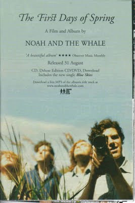
This magazine advertisement is promoting the release of Noah and the whales album The First Days of Spring. This advertisement would be published in a music magazine such as NME and it will help promote the album for its audience to see and then buy.

The advertisement shows the album title, band name, critic review of the album, when its released, what the album contains inside with it being a CD/DVD release and finally it says you download a free MP3 of the album and where you can download it from. The album title is in a different font to the other text as it’s the main album title and the band want it to stand out the most of the advertisement because then their audience will know what they need to purchase. Its in a fancy font which looks like it quite a spring season font which emphasises the album name. The next biggest font is the band name Noah and the whale and that’s because it’s the next most important thing because obviously the audience need to know who the band are in case they don’t recognise them from the photo. The next biggest text is the next important text as it is following of which is most important to the audience, as the release date is the next biggest text as it shows its released 31 August which is important to the audience so they know when they can purchase the album. The rest of the font follow the same font and style as its just text which is not as important but filling up the advertisement. Personally I think a good idea of this advertisement is the critic review because that’s going to be a good point to show to their audience as if the critics have given the album a good review then their audience will be more confident to purchase it. The photo which is used is of the band and It fills the whole advertisement. The photo is of the actual album cover but stretched out into a portrait style which more of the sky added to this photo so it fills the whole page. The photo suits the advertisement well because due to the album being called The First Days of Spring, the word spring is the most important because the photo looks to be shot in a field which emphasises the word spring and what the album is trying to get across to its audience. The photo shows the four band members which the main singer looking to be taking a photo with a camera whilst the other three members look up to the sky. The main singer looks to be the only singer in focus as he is probably the most important band member as he is the singer. The rest of the members are behind the main singer making him the dominant member of the band.

Overall the advertisement is showing its audience what it wants to with it covering all the important things which need to be considered when making a magazine advertisement.

Subsidiary Product 2 - Magazine advertisement - Analysis of codes and conventions

When a magazine advertisement is published for an album release it usually follows several conventions such as The band name and the album its advertising, part of the main album cover photo, critic reviews, distribution logo, band/artist website, and a brief introduction of what the album consists of such as hit singles.

The band/artists name and album title are usually the biggest fonts on the page as they’re advertising the band or artists album release so with this text being the biggest its catching the eye of the audience when they’re reading the magazine also sometimes they will use different text to what they have used on the actual album so its different and unique providing more eye catching advertising for their audience. Also sometimes with the font, they often use font which shows the specific genre of the music they’re advertising such as if an album has an autumn sense to it then they could possibly input falling leaves into the font which is artistic and unique. The next thing used on a magazine advertisement is the use of the album cover photo which will be put onto the advertisement however, sometimes the bands/artists don’t choose to use all of the cover they often use part of it just to show which album it is advertising. The use of the album cover instantly shows the audience whose album it is and what album it’s advertising. The album cover photo is usually the eye-catching point of the advertising as the colours and size of the photo are attractive for their audience and the photo is mainly what many people like to view and what catches their eye mostly on an advertisement or album cover. Another main convention of magazine advertisements for an album release is the use of critic reviews, bands and artists often use these around the album cover photo to give other magazines or media related companies perspectives on the album. This is a great addition to an advertisement because it tells the audience what to expect from the album and whether or not it’s good enough to purchase. Even though this is somebody else’s view on the album it can still be a huge impact on the audience mainly because everybody likes to hear if the album is worth listening to or not. Critic reviews are usually in a bold and attractive coloured font because it has to be eye catching for their audience as it’s a main part of the advertising because the critic reviews are selling the album because the reviews are always good ones on the advertisements. Another convention used is distribution logos these are always relatively small as they aren’t very important however, they’re still used to show who is distributing the album and this can allow the audience to possibly view this record labels website and look for other bands and artists who are signed to the label. The use of the band or artists website is good because it allows anybody with an internet connection to easily look up the band or artist on their website and find news about them for possibly upcoming tours or just information about a latest single or even the album which is being advertised in the magazine. The text for the website is often always small because its not really important however, its still easily noticed and readable for the audience. Finally a brief introduction to what songs and on the album is very important to the audience because it shows them what to expect on the album and how many songs will be on it. The main positive of this is that if the audience have listened to a song of the band or artist and then not known if it will be on their album then this advertisement will let them know.

Overall the use of these conventions help to make the advertisement attractive to the audience and provides the most important information to help the audience choose whether to purchase the album or not.

Final Product - CD Covers


This is my Final front cover for my Digipack.


This is my final back cover for my Digipack.

Editing of CD Covers

FRONT COVER


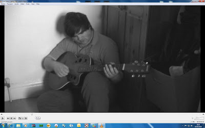
With these photos it shows how I have used the print screen button to screenshot parts from my music video then transfer these screenshots to the computer programme Paint from there I have cropped all my photos and the re-sized them to fit a CD cover box then I finally saved the new image to use when completing my final CD covers.


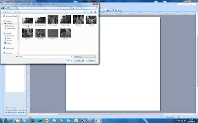
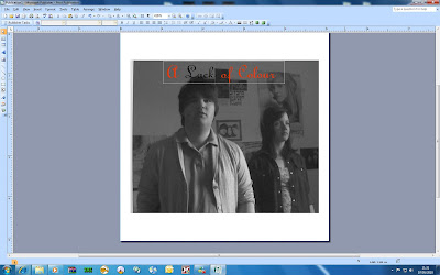
Here I have transferred my photo to Microsoft Publisher to begin editing it.


Here I have gone onto the website http://www.1001freefonts.com/ and then used the font Annabel Script which is the text I chose to use for my album name on my front cover.


Here is how the font looks on top of my album cover.


Here is the photo for my album cover but I have used an effect on it. I did this my clicking on the photo then using the transparent tool. I did this to provide a more modern edge to the photo and make it more attractive to the audience.


Here is my final front cover for my Digipack. I again used http://www.1001freefonts.com/ for the band name and the lyric at the bottom of the cover. The band name is the same font as the album name which is Annabel Script whereas the lyric at the bottom is using a handwriting font which I wanted to use to give it more of an effect that the band has penned the lyric themselves and this font is called Cheyenne Hand Italic.

BACK COVER


Here is the photo I have chosen for my back cover and this will show how I have edited it to the final product.


Here are 4 photos I am going to use on the back cover of my Digipack. The photo on the bottom left hand corner has been re sized to 40x40 and I will be doing this for the rest of the photos as well so that they fit on the back cover where I want them to.


This is how I re sized the photos to 40x40 by opening them up in Paint then clicking on the re size button.


Here are the 4 photos I am using on my back cover and how I am going to position them.


Here I have inserted a bar code which I got of google images and then transferred it onto my back cover after I had saved it to my desktop from google.


Here I have inserted a text box so I could write the track list on the back cover. I have used the same font as I used on the front cover for the band name and album title, which is Annabel Script, I did this because it provides consistency throughout the Digipack and I believe it works well.


Here I have found the record label of the band whose song I used for my music video and I have copied it so it can be transferred onto my back cover.


Here I have made the Universal Records logo Transparent so that it doesn't have a white filled background.


This is my final back cover for my Digipack.


Photographs taken for CD Covers


Here are the photos which I have chosen to use in the production of my CD Digipack. Due to my own character, in my video, having other commitments I have had to use screenshots from my actual video so I have took time to find the ones which I believe provide the most impact for the audience and the ones which will show what the narrative of my video is trying to portray.

Drafts of CD Covers

Here I have drafted several different designs of front cover ideas and then I will conduct some audience research to help me choose the best option.

Textual Analysis of Back Cover 3


This is the back cover for Michael Jacksons history album. This cover follows the same image of the sky but this time without the image of Michael Jackson. The use of sky follows the same imagery taken from the front cover as the sky on the front cover is showing the statues highness and power. This is a good idea because it follow the same image for the front and back covers which looks well presented and shows that it has a meaning behind it because its not just all over the place and not followed. The text is all the same font style. The album has two discs and the album title is put before the start of both sets of lyrics for both disks. Again HIS is an italic and bigger font to the TORY this is emphasising that its HIS history meaning Michael Jacksons. The first disk before the lyrics it says History Begins and the for the second set of lyrics it says History Continues this is showing that with both disks of amazing songs its emphasising that Michael Jackson has had an illustrious career. The lyrics are all in the same font of block capitals which shows it easy to see for the audience and it also goes well with the background again making it easy to read. At the top left it shows a quote from the actual singer himself Michael Jackson which will make the audience want to buy the album so they have an actual quotation of what Michael said. This album cover doesn’t have a bar code which is fairly unique because most albums follow the convention of having a bar cover at either the bottom right or left hand side of the cover. The trademark logos of the distributors and the text about the producers are at the bottom right hand side and this text is significantly smaller than the rest of the text as it isn’t seen as important as the main titles and lyrics of the album.

Textual Analysis of Front Cover 3


The album is a Michael Jackson album called History. It was released in 1995 and it contains all the greatest hits up to that date. This album got to number 1 in several countries and was a massive hit in the whole world.

The main focus of the cover is the massive statue of Michael Jackson that instantly implies that he is the main priority of the album and he is the king of pop. The title of his name and the title of the album vary in sizes and font however, all the text is in block capitals which gives more impact than normal text. The fact that Jackson and History is in a bigger font is because the use of Jackson is showing his last name and that he is the only Jackson around and History is the name of the album so that’s what he wants everyone to see when they’re in the shops to purchase the album. The statue of Michael Jackson is an actual statue what was made in real life. Statues of people such as famous people are to represent their work in their specific industry, they usually show the history of that certain person as their history has shaped life. So this statue of Michael Jackson goes with the title of the album ‘History’ as the statue is historic of his career. The background of the sky indicates that the statue is standing tall and further expressing his King of Pop status. The statue on the album will be shown to the audience when they see the album and they will instantly know its Michael Jackson because he is so iconic to his career and this statue emphasises this.

Textual Analysis of Back Cover 2


This is the back cover for Death Cab For Cuties album Plans. This cover looks much like the front cover but differently set out. This back cover is more dark and mysterious where the front cover is easy to see. Again the back cover used the same photo of the plant but its harder to see. The use of the wholes in the wall at the back is again used to show the sun shining through like it did on the front cover. However, on this cover the light is much brighter whereas the plant is darker. This is showing the alternate to the front cover which will show the audience both sides of each main part of the covers. The lyrics are set out to the left hand side of the cover just one after the other again using the same font style and colour. The cover is very basic and doesn’t really say much about it. The lyrics are dark colours like the rest of the cover showing a mysterious style. The bar code is at the bottom left hand side of the cover with the text about the record label and band website is on the right hand side. The bands website is used on the cover which is good for the audience as it allows them to view the website if they have a computer with the internet. The cover overall doesn’t really look very presentable as it looks quite basic and easy to make however, this doesn’t give any facts that the band are the same as the album has sold exceptionally well.

Textual Analysis of Front Cover 2


This album cover is showing my chosen band Death Cab For Cutie’s 6th studio album which was brought out back in 2005.

This album cover doesn’t really display much, its basically the title of the band and title of the album overlaying on the cover which is of grass and a plant. The background of the album is out of focus symbolising that it’s the title and plant which they want to emphasise mainly to audience. The album cover sends an image to the audience that there isn’t really a story behind the cover. The title doesn’t go with the cover and the imaging of title, the title is trying to get the point across that nobody makes a plan they live their life how it pans out and that emphasises that the album doesn’t have anything set out in stone it will come across how the band have wanted it to. The title of the album PLANS is shown in block capitals so that it is the main important meaning behind the album it want to give that certain meaning to each song which is represented to the audience. The band name is in normal letters which no capitals as the band are saying the title is more important than the band name because the band have been around several years whereas the album title has never been around before so it is more important to get that title across. The image is showing a contrast of colours between red and green which are fairly colour and stand out however, the background is full black with light shining through. Overall the cover is quite dark and possible represents how mellow the album is and how easy it comes across because the cover is also easy. The cover overall is easily set out and it doesn’t look like much effort has gone into the cover whereas the album is amazing. So I think the album is trying to get across that its quite mellow and easy to listen to which the album cover also represents.

Textual Analysis of Back Cover 1


The back cover for Chris Browns album Graffiti is set out in three columns as the lyrics are on the left then the photo of Chris Brown in the middle and the rest of the lyrics on the right side of the cover. The main emphasis of the cover is again the photo of Chris Brown as its not really following and meaning to the cover however, the photo look quite futuristic with the use of the glasses as they look unique which is emphasising his own style and music scene. The way the lyrics are set out allow the cover space to be used up so it isn’t leave much blank space. The lyrics use a unique font style which both the front and back covers follow which is the graffiti style font. This font is used for all the important text on the covers which is a good way to follow the structure and unique meaning of the word graffiti which is both the title of the album and the font style. The use of a dark blue background goes well with the white text as its easy to see for the audience. The bottom half of the cover shows all the information about the producer of the album and the record label who is distributing it this text is all in the same font as its more serious and isn’t really part of the album style. The bar cover is also set out on the bottom right hand side which again fills up the space this allows the cover to look well presented and set out which gives a sense of a well worked cover.

Textual Analysis of Front Cover 1


This front cover is for Chris Browns' latest album Graffiti. It was released in 2009 and is his latest album to be released.

The album is called Graffiti and it shows the album singer Chris Brown holding a can of spray paint expressing the album name graffiti as he is making graffiti. Chris Brown is the main focus of the album as he is the biggest thing on the album he is stood holding a guitar on his back and a can of spray paint. The guitar shows that his album is moving into a kind of rock genre which is different to his other albums. It shows the rock side of the album just by showing him with a guitar because people are used to see Chris Brown as just a singer but this album cover showing him with a guitar will instantly show his audience that he is going a different way now and putting some rock into his music. The album doesn’t have his own name on it, it just has the album name. This is saying that he has made such a big name for himself that he doesn’t need his name on the album because people will already know who he is just by showing himself on the album. The album name Graffiti is in a unique graffiti font which Chris Brown is shown spraying himself from the spray paint can therefore showing why its called Graffiti. Unlike other albums this cover is emphasising the album name and due to Chris Brown shown making the album name himself its giving a sort of meaning behind the cover which is how I want my album cover to come across. The hand what Chris Brown is using to spray the graffiti is bionic this is showing a sense of futuristic further emphasising that his album will be like nothing anyone has ever heard him sing before. The album is quite dark and this shows the dark side of the album and how its changed from upbeat to more of a rock sound. It also shows the seriousness of the album and how Chris Brown wants his audience to see that he is serious about this album.

Subsidiary Product 1 - CD Covers Analysis of Codes and Conventions

When an artist or band produce the covers for their CD released album they follow several codes and conventions in which every CD covers follow for example, The main title being the band/artist name, the title of the album, main photo for the album then for the back cover of the album they use a bar code, track list for the album, the main photo, distribution logos and possibly the band or artists website.

The main title/masthead which ever cover follows is the band or artists name and this will probably always be the first or second biggest font on the cover as it’s saying to the audience that this album is theirs. They will use this to try and attract the audience to buy the album because if the artist or band are popular then their name will be the biggest font or the most stylish font so that their audience will see it and instantly know that it’s the album they want to buy. As most bands and artists follow this convention some choose not to have their own name on the album and this may be because they’re very popular and if they use their self as the main photo then their audience will already know that this album is the one they want to buy even without having their name on it. The next convention is the title of the album every artist/band has this on their album because its showing their audience a possible brief introduction about the album by giving the album name. The title of the album isn’t very popular on album covers in the sense of attractiveness but it does show the audience that it’s a new album because all the artists/bands albums will have different names. Font colour is also what bands/artists use to express attractiveness because sometimes they use very colourful fonts to catch the eye of their audience however, sometimes the font colour follows the colours of the main photo which provides consistency for the audience. The album title also sometimes provides how the album is trying to be expressed for example sometimes bands/artists will use stylish fonts or unique fonts to what the album is about and this will show their audience a possible genre behind the album. Next is the main photo for the album and this is basically the most important part of the album as it’s the part which is most attractive for the audience as it draws them in to whose album it is and what the album is about. A lot of bands/artists use photos of themselves which instantly shows their audience whose album it is which is a good way to find the album easily in the shops however, it could be seen as boring to use a photo of themselves. So some bands and artists use photos which aren’t themselves and possibly give of what kind of genre the album is.

The back cover of an album has conventions which bands and artists usually all follow the same way. Every album usually has a bar code at either the left or right bottom corner of the cover and the is basically use so that the shops who are selling the album can scan to get the price of the album. The track list for the album is always on the back cover of the album and this gives a very brief insight for the audience for what kind of songs the album will consist of. Even though you can’t physically listen to the songs by their names they still give the audience a sense of meaning behind the songs. Back covers like the front usually always have a main photo in which will cover the whole background of the cover and then the text will overlap in front of the photo. Around the bar code, albums usually have distribution logos which show what record label are distributing the album and their audience will recognise this however, they’re only very small logos as they aren’t very important. Finally near the bar code again the band or artist usually show their website URL so that their audience have a different way to access information and news about he band or artist.

Overall with these codes and conventions it allows people who are buying the albums to instantly know that’s its an album as every band or artist usually follow them.

Main Product - Music Video

Here is my final edited version of my Music Promo Video.


Edit Log Sheet

Shooting Schedule

During my two week half term break from college I decided to film my media over two days. I chose the days where myself and the other person in my music video where free to film all day.

I filmed on the 10th and 11th of April . Also I filmed earlier shots during the 1st week of April, the date was 2nd April however, these shots where not very good and due to the people I intended to use in my music video having over commitments I had to choose other days to film.